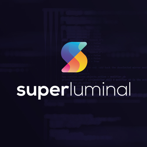
Superluminal
Branding & Web
Superluminal are a new company focusing on making software tools which will allow their customers to improve the performance of whatever software they’re making. Hence the name Superluminal which means ‘faster than light’. We produced an interesting brand that allowed us to show off the sense of speed and light, producing a range of collateral from business cards to interface design.

Project breakdown
- Branding 60%
- Website Design 20%
- Graphic Design 20%
Client
Superluminal are a new company focusing on making software tools which will allow their customers to improve the performance of whatever software they’re making. Hence the name Superluminal which means ‘faster than light’.
Briefing
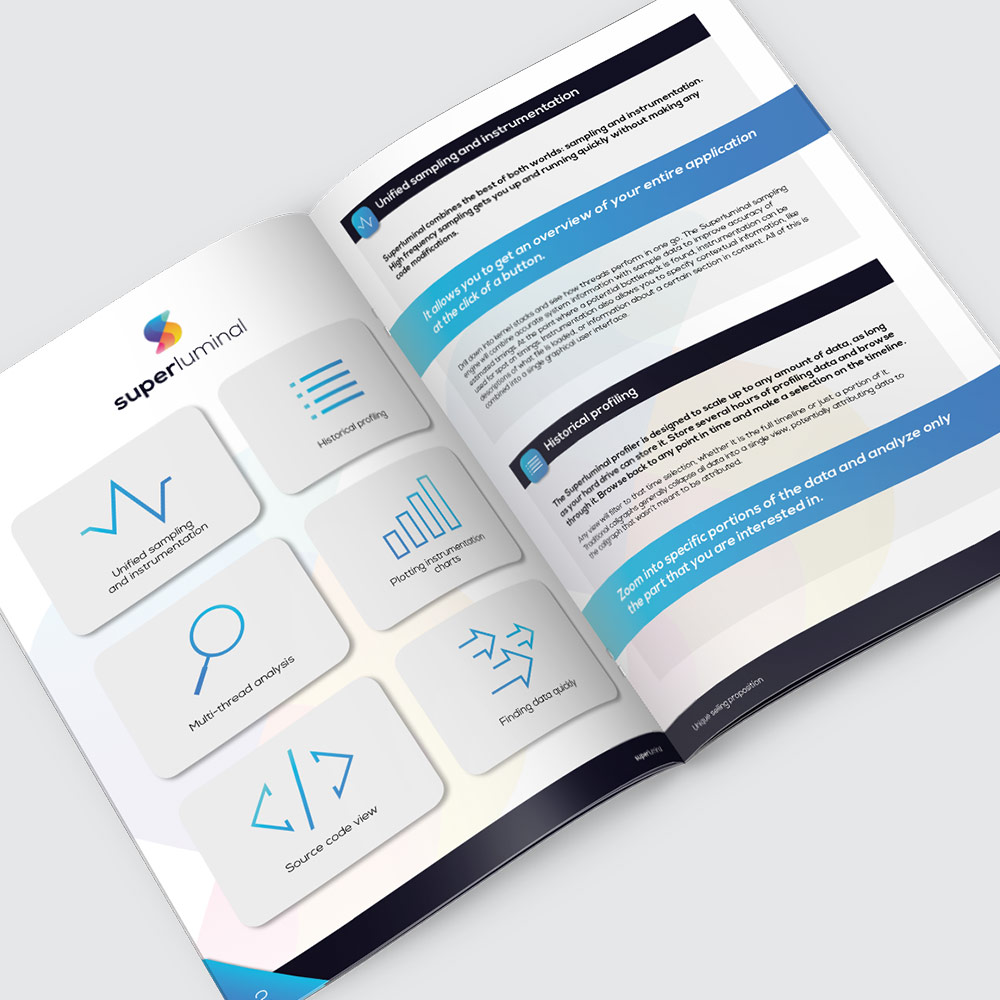
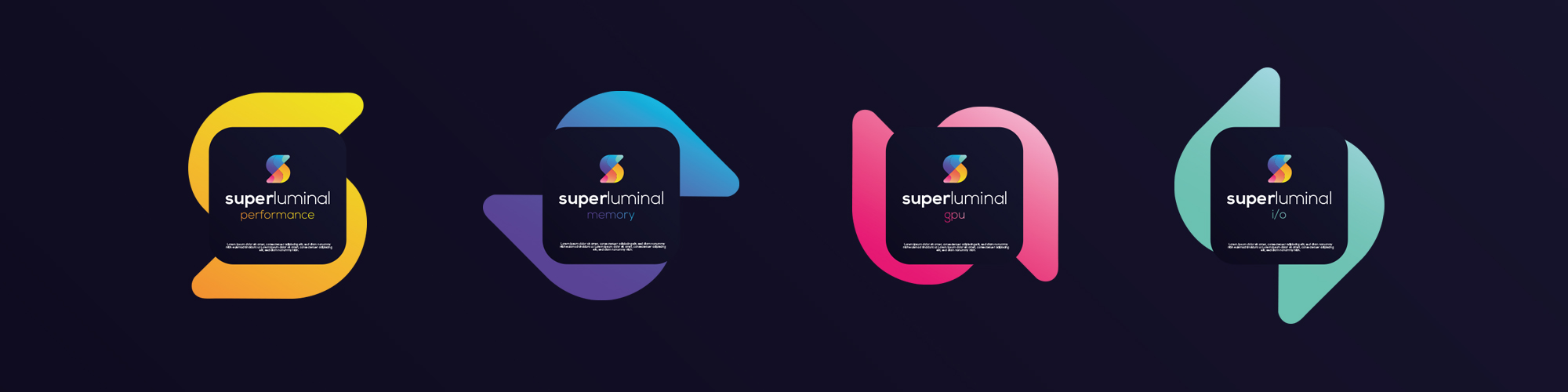
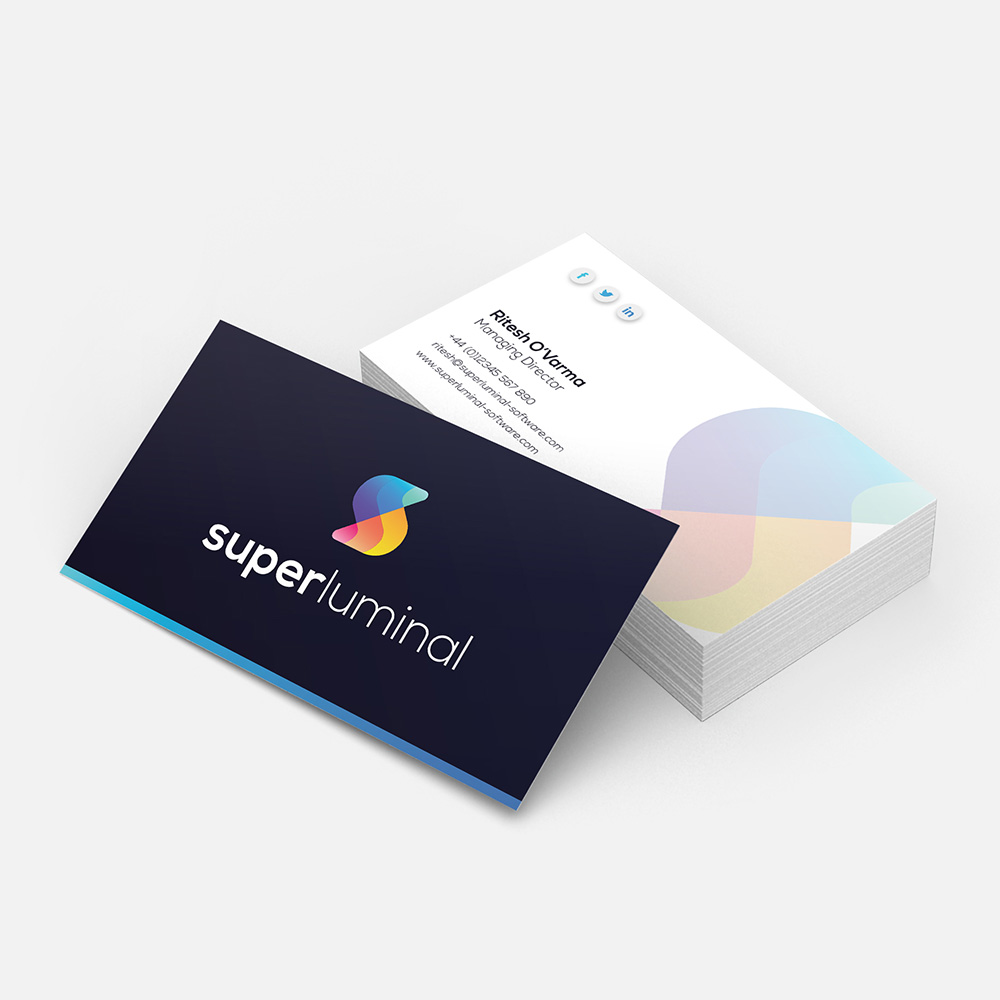
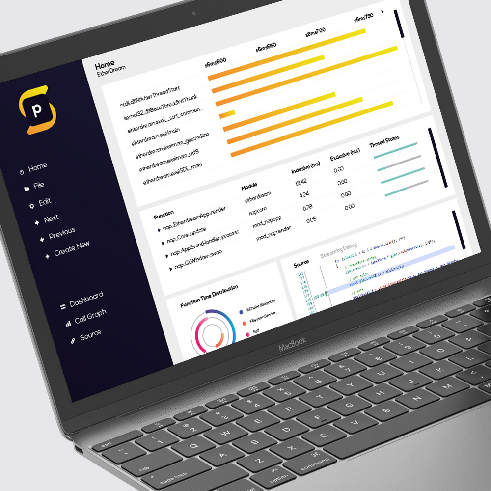
Superluminal products are all about speed and performance, so they wanted to reflect that in the branding. We produced a vibrant, contrasting, gradient style symbol to visually show of the sense of speed, we then were able to apply this to look and feel across product sub-brands, business cards, brochures, website and their software interface.
Outcome
Superluminal now have a vibrant, eye catching brand which is consistent through all of it’s collateral, reflecting the focus of their business – speed and performance.
And we can do the same for you...
We have vast experience in building distinctive identities for all sectors, that go onto forge trusted and successful brands. From a simple logo and colour scheme to complete bespoke applications. Brand identity is usually the first contact customers have with your company – make sure it does you justice.