The London 2012 Olympics are here!
Want to learn more?
We love talking all things design and marketing, so feel free to get in touch if you want to find out more about the things covered in this post.

Like it or loathe it, the Olympics are here again and with London hosting the games it’s impossible to ignore. Here’s a special blog post to celebrate by taking a look at the Olympic games from a design perspective; the good, the bad and the ugly.
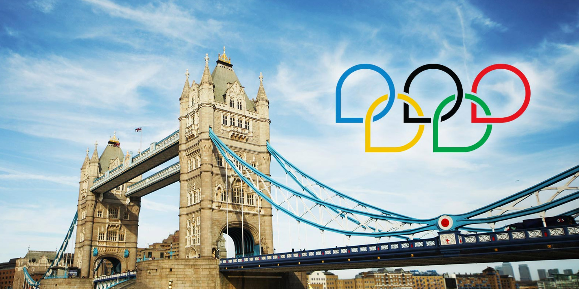
The good: The Olympic rings

100 years old and still better than the London 2012 logo
Designed in 1912 by the founder of the modern Olympic Games, Baron Pierre de Coubertin, the image of five interlocking rings has become synonymous with the games and has stood the test of time to become a design classic.
Created with a theme of unity and coming together in mind, the rings represent the five continents of the world with the colours being selected on the basis that they would include at least one element from the flag of each participating country.
The Olympic rings are simple yet impactful, easily reproducible yet distinctive. They conceptually embody the ethos of the event it represents and are an all round excellent example of everything that a good logo should strive to be.
The bad: London 2012 logo
Tragically misunderstood or deliberate marketing stunt? The ‘distinctive’ London 2012 design certainly succeeded in becoming infamous around the globe, however when almost 50,000 people sign a petition to have the logo changed within just 2 days of it’s unveiling that’s usually an indicator that something has gone wrong.
No words can suffice.
To its credit the logo design did an admirable job of bringing together cultures, even if it was only in their mutual hatred of the design; a Jewish viewer wrote in to complain to the BBC that it looked like the Nazi SS symbol while Iran threatened to boycott the games because from a certain convoluted angle it spells ‘Zion’.
Perhaps it’s greatest strength and biggest flaw is that the abstract design is so open to interpretation, although we are far too professional to discuss that here.
The creative process to ‘produce’ this logo took over a year and cost in excess of £400,000, a figure which would seem obscene if it wasn’t a relative bargain compared to the overall cost of hosting the games. It was intended to encapsulate creativity, energy and an edgy London attitude but has instead become something of a joke.
At least it managed to make people laugh, which is more than can be said for the official mascots.
The ugly:
Would it be unfair to bring up the London 2012 logo again? Did I mention that the mascot is a terrifying one eyed monster?

The Olympic games have changed a lot since 776 BC!
Ok, let’s focus on some more positive trivia; famously originating in Greece, did you know that the Ancient Olympic games and their associated events have also given us many words that are still in use today?
For example, the first recorded Olympic games only consisted of a single event – the Stade – which was a footrace named after the period of measurement for the distance run (about 600 feet). Since the track for the event was (obviously) a stade in length, and purpose built for that occasion so that people could stand and watch, it became known as a Stadium.
The word Gymnasium also comes from the Greek root ‘gymnos’,meaning nude; athletes in the ancient Olympic games would participate in the nude and the literal translation of ‘gymnasium’ is ‘school for naked exercise’ – a fact which is entirely unrelated to the title of this section or my long expired gym membership!
I hope this has been educational, here’s wishing Team GB the best of luck and if you want to go for gold with logo design then get in touch – we specialise in delivering professional and effective branding solutions which make you stand out from the crowd and generate more business, plus it won’t cost a six figure sum to do it either!