The EU referendum voting guide

Want to learn more?
Whether you’re planning to launch your own political movement or just brainwash people en masse for more traditional business-related reasons, we can help ustilise the power of design to get your message across

If you’ve turned on the news lately you’ll no doubt be aware of the heated debate surrounding our membership of the EU. Likewise, if you’ve checked your postbox lately you’ve probably received some unsolicited marketing material. The former is of interest to a lot of people, the latter probably only to myself as a design nerd who enjoys critiquing his spam mail.
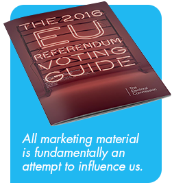 That’s why I found it particularly interesting when this booklet came through – a mailer from The Electoral Commission showcasing both sides of the debate. Given that all marketing material is fundamentally an attempt to influence us one way or another, and this particular piece is attempting to shape the future of the UK (as opposed to my next choice of pizza topping), the stakes couldn’t get much higher – I had to dissect it. What surprised me most was just how far from impartial it felt upon first impression.
Now you’re speaking my language
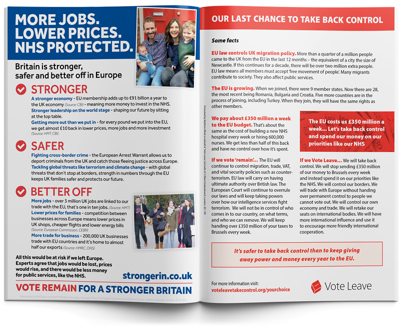
The referendum has been summed up as a contest between risk takers and the risk averse, a desire for security versus independence, and we can see these viewpoints through the choice of language used – the In campaign includes various combinations of ‘Stronger’ and ‘Safer’ 8 times, while Vote Leave manages to squeeze in the word ‘Control’ a whopping 9 times.
However to get that far we are assuming you read it cover to cover, which is rarely the case with unsolicited marketing material. It’s not just the words themselves which matter, it’s how they are displayed. Effective visual communication should convey the intended message while requiring minimal effort on behalf of the reader – beyond being easy to read, it should compel the viewer to read more.
Now we’ve established their respective positions and intentions, let’s see which design works best.
Click to download a PDF of the original publication
Should I stay or should I go?
Viewed in isolation they both achieve their goals with varying degrees of success; Stronger In incorporates a calming blue palette and images of families and to evoke a feeling of safety, while Vote Leave confidently states this is “Our last chance” on a red background, evoking a sense of danger and urgency. Alone, neither is especially bad, however this changes when they are viewed side by side…
What Stronger In gets right:
- A powerful headline
- Large headings to lead you in
- Bite-size snippets of information
- Frequent emphasis of key words to draw the eye
- Related imagery to evoke complimentary emotions
- Positive supporting iconography
- Prominent call to action
What Vote Leave gets right:
- The pull out statement offers a nice summary
- Some facts, I assume
- (their choice of wording, not mine)
Comparing apples to apples
Stronger In has a more striking design, with a better hierarchy and effective use of emphasis. When combined with it’s fortunate position on the left side of the spread it utterly dominates – given the prominence of it’s title block you could be forgiven for assuming it was one continuous article over both pages as the much smaller Vote Leave formatting look like subheadings and supporting text in comparison.

The importance of compelling headings
This isn’t helped by the fact that nowhere in the top half of the page for Vote Leave does it even mention that it is building an argument for leaving, and based on the headings for the bottom two columns it almost appears impartial with equal prominence to “If we vote remain” and “If we vote leave”.
It isn’t a simple case of bigger is better either, Stronger In makes intelligent use of contrast so that key points stand out and hook you in to read more. Vote Leave highlights facts and questions, while Stronger In highlights answers and outcomes ensuring you take away their point even at a glance – it requires less attention from the casual viewer who may be in the process of transporting it from their post pile to the recycling bin.

Bite-sized, structured content VS reading it all to discover their point
Considering this type of material stands almost no chance of converting somebody who has already made up their mind it’s audience is the undecided, the uninformed, and potentially the initially uninterested. It’s goal is to hook people into the debate and get them to take a side. That means it’s vital that their argument is concisely and effectively conveyed at a glance, and that is why the Vote Leave advert comes across so poorly.
But surely the facts should speak for themselves…
 So, is it biased towards The In campaign or did the Vote Leave camp just drop the ball? As previously stated this particular publication was put out by a third party, one which is theoretically impartial and who’s sole intent is to educate the public. If impartiality was the main goal, perhaps the formatting should have been neutral and presented the facts alone. Of course, this is politics so even the validity of the facts and figures upon which each sides arguments are based is hotly debated, making this easier said than done.
Instead the Electoral Commission offered a platform for both campaigns to present their case, with a blank canvas of equal size to each of them, meaning the success or failure of their effort was down to the content (and design) provided by each camp. Stronger In had a minor advantage thanks to their positioning on the left page but that could have been down to a coin flip and ultimately their superior design was the deciding factor.
While neither are artistic masterpieces I can only assume Vote Leave heard ‘this is a huge opportunity which will be sent to households nationwide’ and their response was to fire up a 2 column grid in Microsoft Word and call it a day.
So why should campaigns invest in design?
Presumably the people orchestrating these campaigns strongly believe in their cause, to them it is of vital importance that the general public votes their way – that is why they are running the campaign after all. That seems contrary to the “it’ll do” approach seen in most political material. The booklet isn’t an isolated example either, if you visit the websites listed for both campaigns you’ll find more of the same.
 For the truly big issues, where being persuasive is paramount, the associated marketing should be nothing less than exemplary. While I’m sure there are budgetary constraints involved the cost of employing a (good) professional designer would be a drop in the ocean compared to printing, disseminating and delivering leaflets like these nationwide. If you are going to the effort of getting your message in front of the general public you need to not only ensure it catches their eye (so they’ll actually read it) but you want to ensure it’s effective too.
To draw a parallel in private business, it’s like the companies who spend thousands on booking an advert placement or trade stand then baulk at investing a fraction of their budget in artwork for the very same advert or stand design. Yes, you’ll be raising your profile and people will see you even if it’s not professionally designed, but you’ll also be seen alongside your biggest competitors and if the mediocrity of your material puts you so firmly in their shadow that nobody notices you, it’s been an expensive and pointless endeavour. The same companies usually forego these activities in the future because “they don’t work”, oblivious to the fact that they do work if done right.
Final thoughts…
Ultimately you could argue that political issues such as these should be decided based on the facts and careful consideration rather than influenced by advertising, but the fact of the matter is that both sides are conducting a marketing campaign, and as with all marketing activity you should only do it if you’re going to do it well to ensure it produces the desired results. Otherwise it’s just an exercise in pouring money down the drain (insert EU reference of your choice here).